On a construction site, banner choice usually comes down to what’s available or what’s been used before. But in practice, that decision has a direct impact on how well your signage holds up, not just visually but structurally.
If you’ve dealt with banners loosening, tearing, or needing replacement sooner than expected, it’s rarely down to installation alone. In most cases, it comes back to choosing the wrong material for the conditions. Whether you’re planning construction site hoarding or considering more rigid options like aluminium composite board, understanding how each performs in real conditions makes a noticeable difference.
Understanding the Role of Banners in Construction Site Hoarding
On active sites, banners aren’t just there for branding. They’re part of how the site presents itself to the public, how information is communicated, and how boundaries are visually managed.
What often gets overlooked is how much the environment affects performance. A sheltered urban site behaves very differently from an exposed roadside or open development. That’s why the material you choose for your construction site hoarding needs to match the conditions it will actually face.
Mesh vs PVC Banners – What’s the Core Difference?
Both materials are widely used, but they respond very differently once installed.
On-Site Behaviour | Mesh Banner | PVC Banner |
Response to wind | Air passes through, reducing pressure on fixings | Holds wind, which can cause strain over time |
Visual finish on large runs | Slightly diffused, especially up close | Solid and more visually consistent |
Installation on longer hoarding runs | Easier to tension evenly across panels | Requires tighter fixing to avoid movement |
Performance under continuous exposure | More forgiving in changing conditions | Can show wear if constantly under stress |
The difference becomes clearer after a few weeks on site, not on day one.
Choosing the Right Option for Your Site
Once you understand how each material behaves, the real decision comes down to your site conditions. This scenario is where the right choice can save you time and ongoing maintenance or create avoidable issues later.
If Your Site Is Exposed or Affected by Wind
On open sites such as roadside developments or large, uncovered plots, wind isn’t occasional; it’s constant. Over time, that pressure builds across the full length of your construction site hoarding.
In this case, mesh tends to perform better because it allows air to pass through rather than pushing against it. This reduces strain on fixings and helps the banner stay stable without needing regular adjustments.
If Your Site is More Sheltered
On sites that are enclosed or surrounded by buildings, the conditions are far more controlled. Wind has less impact, and the material isn’t under constant stress.
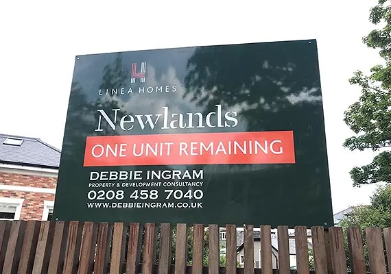
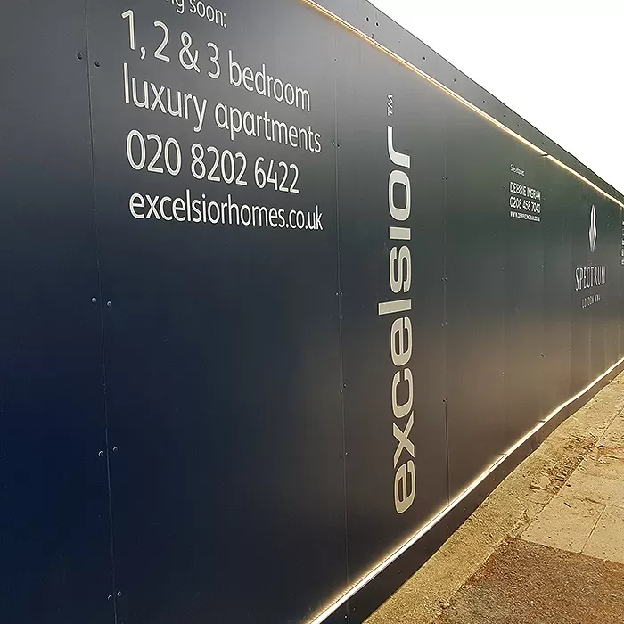
Here, PVC becomes a more suitable option. It provides a smoother, more solid finish, which works well when the focus is on clear branding and a clean overall appearance.
If You’re Thinking About Project Duration
The length of your project also affects which material makes more sense.
For shorter-term use, PVC is often a practical choice, especially when conditions are stable. However, on longer projects, particularly where weather conditions can change a more stable option like mesh can reduce the need for repairs or replacements over time.
Where Most Choices Go Wrong
In most cases, the issue isn’t the material itself; it’s using it in the wrong situation.
For example, installing PVC on an exposed site often requires ongoing maintenance due to constant wind pressure. On the other hand, using mesh where the design relies on sharp detail can reduce the overall visual impact.
The more effective approach is to look at how your site behaves day to day and choose the material based on that, rather than defaulting to what’s commonly used.
How to Choose the Right Material for Your Site
The most reliable way to decide isn’t to start with the material; it’s to look at how your site actually behaves day to day. Once you understand the conditions, the right option becomes much clearer.
Site Condition | What Works in Practice |
Open or wind-exposed site where banners stay under constant tension | Mesh banner to reduce pressure on fixings and maintain stability over longer runs |
High-footfall area where visibility and first impressions matter | PVC banner to deliver a cleaner, more solid finish for branding |
Long-term project where signage is expected to stay in place without frequent updates | Aluminium composite board for a rigid, consistent finish that doesn’t shift over time |
This way, the decision is based on how the signage will perform on your site, not just how it looks or what’s commonly used.
Common Mistakes When Choosing Construction Banners
The most common issues come from picking a material that doesn’t suit the site.
- Using PVC on exposed sites: Looks sharp, but wind can cause frequent adjustments or damage.
- Using mesh for detailed branding: Stable in wind, but can blur logos or graphics, reducing impact.
- Defaulting to banners for long-term projects: Sometimes, a rigid, permanent option like aluminium composite board would save time and costs.
Small choices at the start can lead to bigger problems later, such as repeated maintenance, fading visuals, or unnecessary expenses
Conclusion
Choosing the right construction banner isn’t just about materials it’s about matching the solution to your site conditions and project needs. When you consider exposure, duration, and visual priorities upfront, you avoid unnecessary maintenance, improve brand impact, and save time and cost in the long run.
Ready to plan your next project with the right solution? Book a free consultation and let our team guide you.
Frequently asked questions
Which is better for construction sites – mesh banners or PVC banners?
Mesh banners are usually better for exposed construction sites because they allow wind to pass through. PVC banners work best in sheltered areas where print quality and visual impact matter more than wind resistance.
Are PVC banners durable enough for long construction projects?
Yes, PVC banners are highly durable and weather-resistant when installed in controlled or low-wind areas. They are commonly used where strong visuals and long-term branding are required.
How do I choose the right banner for my construction project?
Start by assessing wind exposure, location, project duration, and visibility needs. The best option often involves selecting the right material based on how the site operates.
Are PVC banners better for printing high-quality graphics?
Yes, PVC banners offer sharper images, stronger colours, and cleaner text. If your goal is branding or promotional messaging at a construction site entrance, PVC is usually the better option.